


Design Process
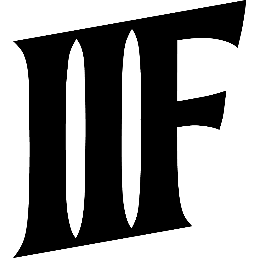
The inspiration for this font came from a handful of questions. Could the principles of Art Deco lettering from the early twentieth century be applied a humanist sans serif? How can I reconcile geometry with the humanist form? How few characters can be changed to completely alter the personality of a font? The most important question I had (I'd never created a font before): Can I create a font?
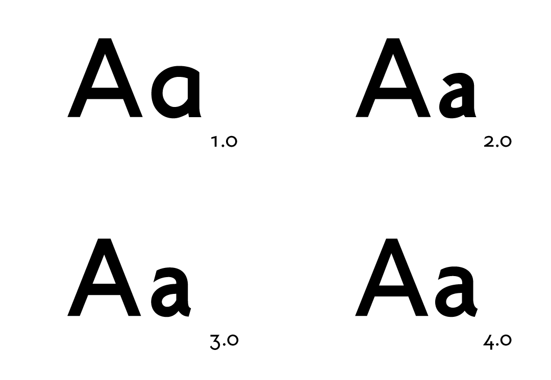
Throughout the project there were four distinct revisions where I took a step back and redrew the entire character set. From the first rough revisions, I learned the software and nuances of stroke contrast. In the beginning, I only had a vision for the uppercase; the lower case was merely an afterthought. As it progressed, the lowercase became a larger part of my focus to create greater readability.
First Digital Sketches
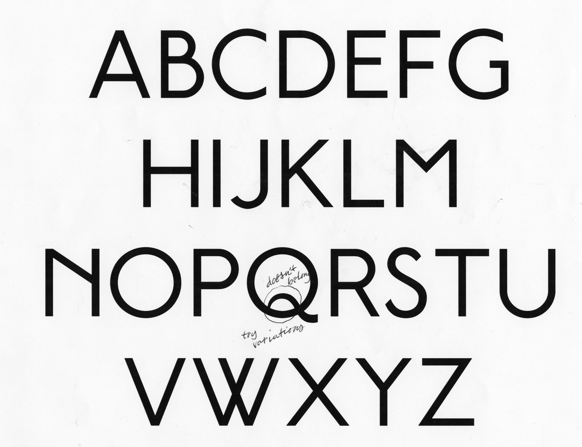
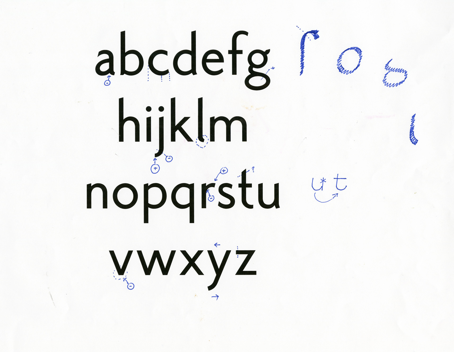
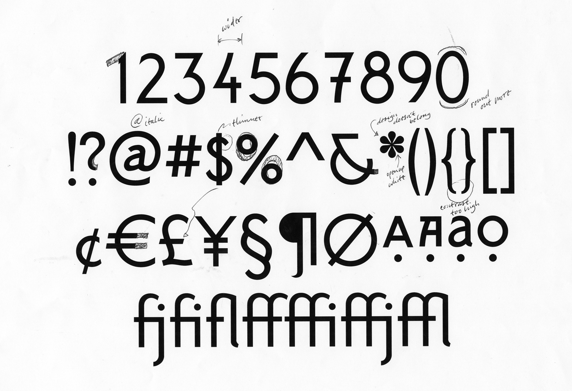
Feedback from the 2019 TypeCon typecrit with John Downer, Hannes Famira, and Mark Jamra.
In the beginning, I drew my characters in Abobe Illustrator, exported them individually as SVGs, and then imported them into FontForge. This initially served me well for what I was trying to create. It allowed me to make glyphs, space them, kern them, and even build stylistic sets and alternates. It began clunky. It forced me to rely on my eye but it became too time-consuming to be practical. This was problematic because it required manual interpolation between weights. I soon bought a FontLab7 license to increase flexibility and save time. I could now compare and edit weights in one file, and above all else, link glyph metrics. I took this opportunity to experiment with x-height and cap crossbar height eventually creating a variable font with three variables: x-height, weight, and cap crossbar height. The end result yielded seven weights with corresponding italics and moderately low x-heights for a sans serif (more on the scale of Futura as compared to Helvetica). In total, the process took me around eight months including periodic subtle revisions such as kerning.