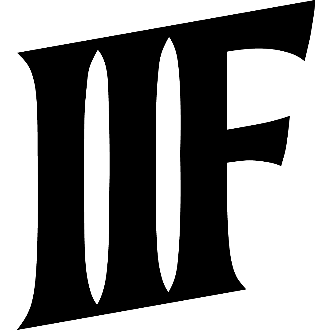
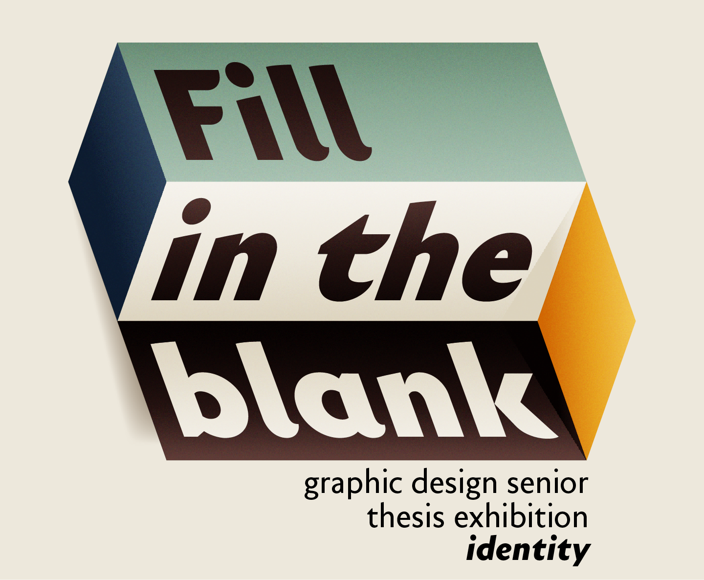
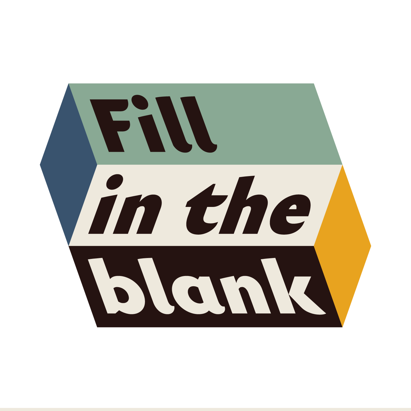
The identity for the Summer 2020 Senior Graphic Design Exhibition: Fill in the blank is built on the idea of uncertainty. As we graduate into the world, our future is even more uncertain than usual for a group of soon-to-be college grads. This identity plays off that idea. The name of the exhibition can have many meanings. The word blank can be replaced with several other words to highlight the unknown nature of this exhibition.
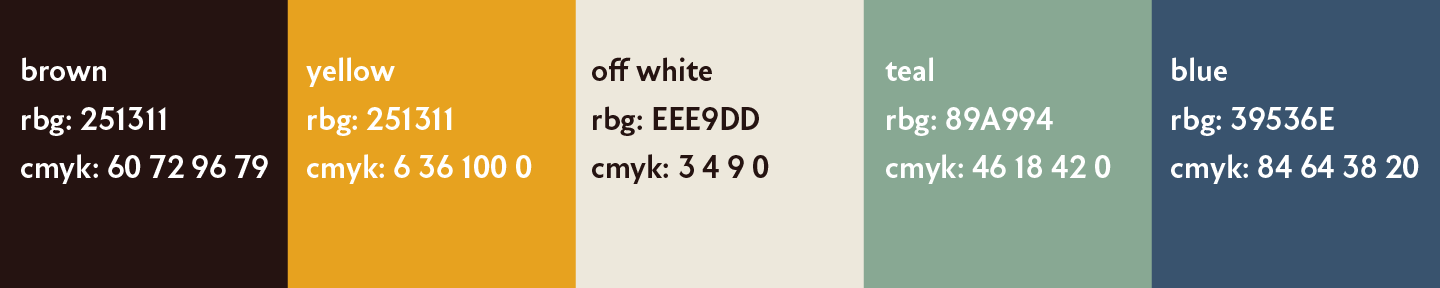
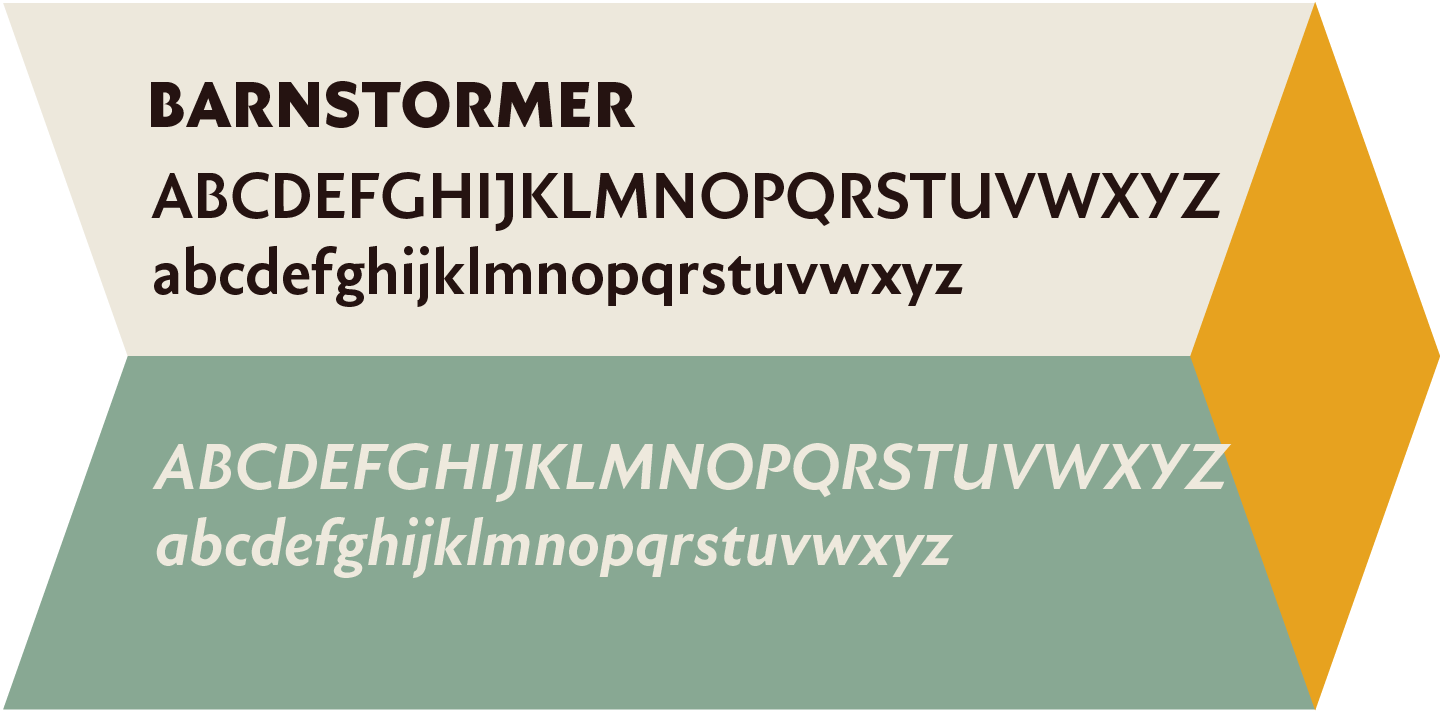
The simple angled geometry of the logo combined with the contrasting italic and back slanted lettering forces the illusion of 3D space. However, the perception of what in the composition is coming out at or receding from the viewer is purposely ambiguous. The colors and lettering in the logo were chosen for their bold yet approachable feel.