
Process

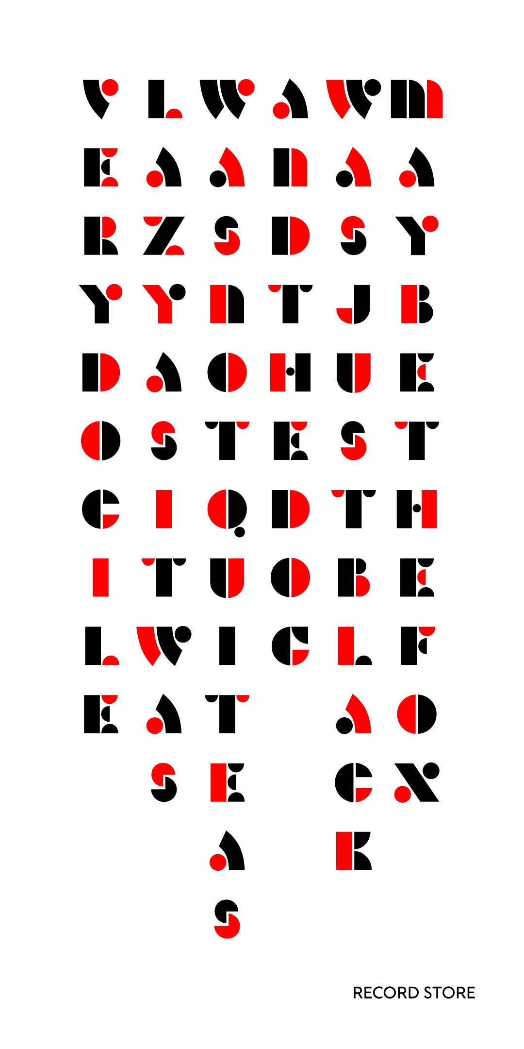
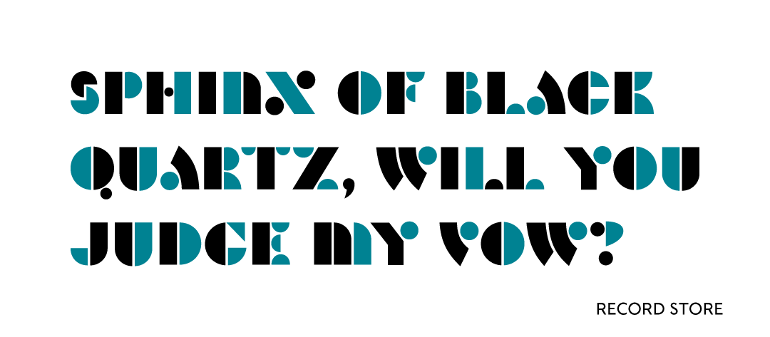
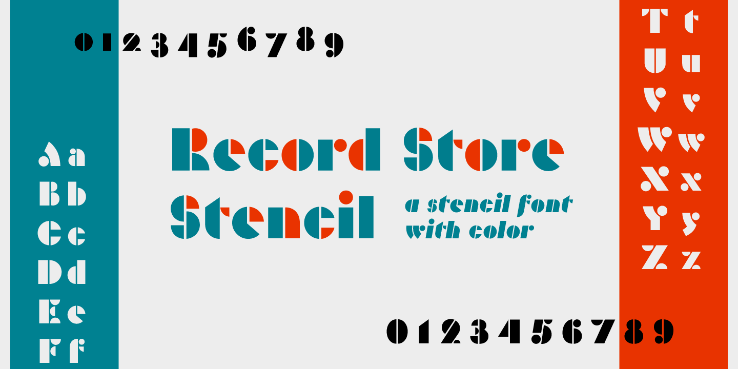
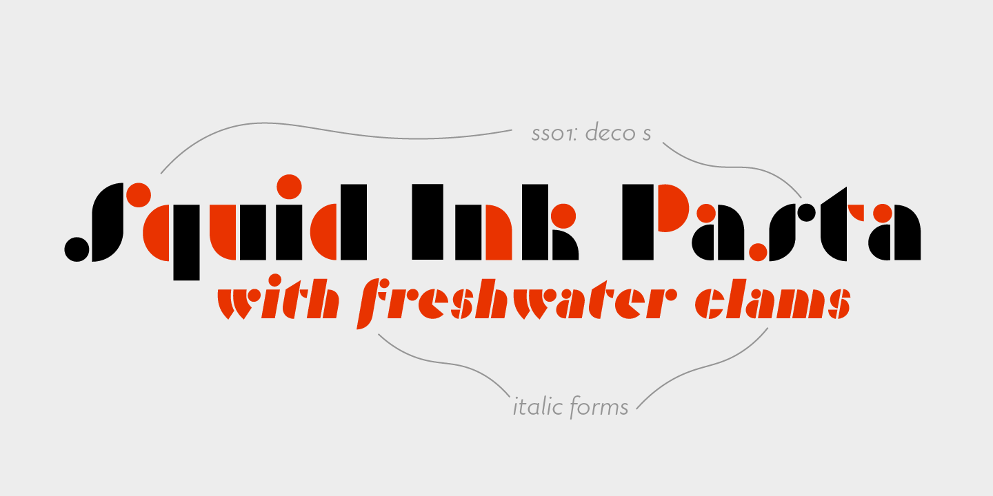
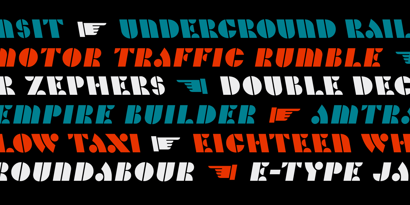
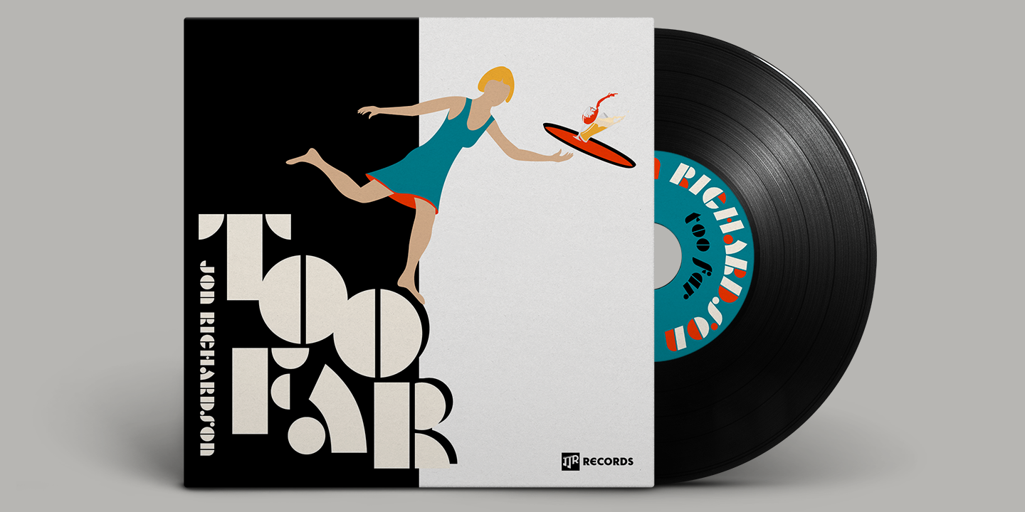
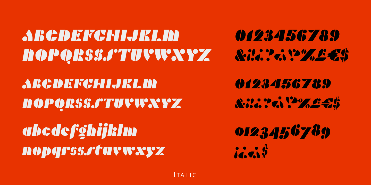
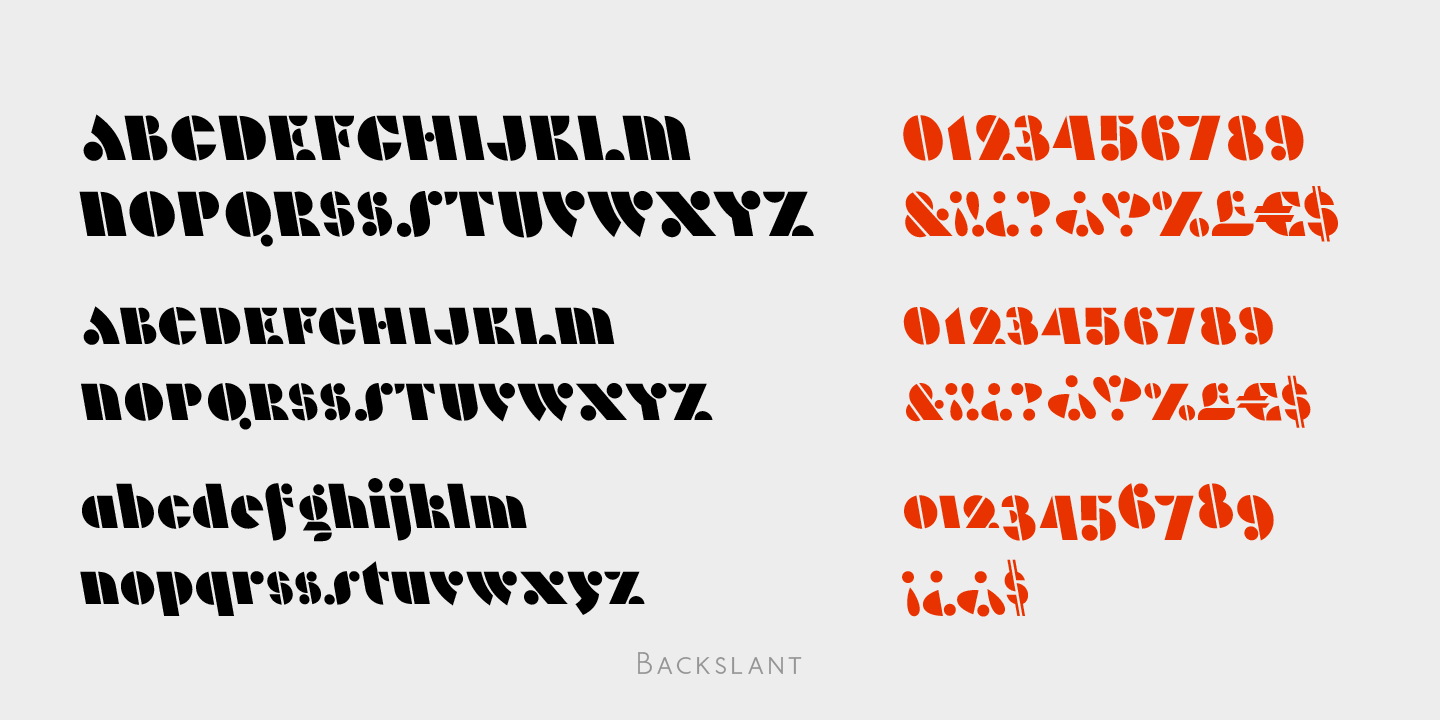
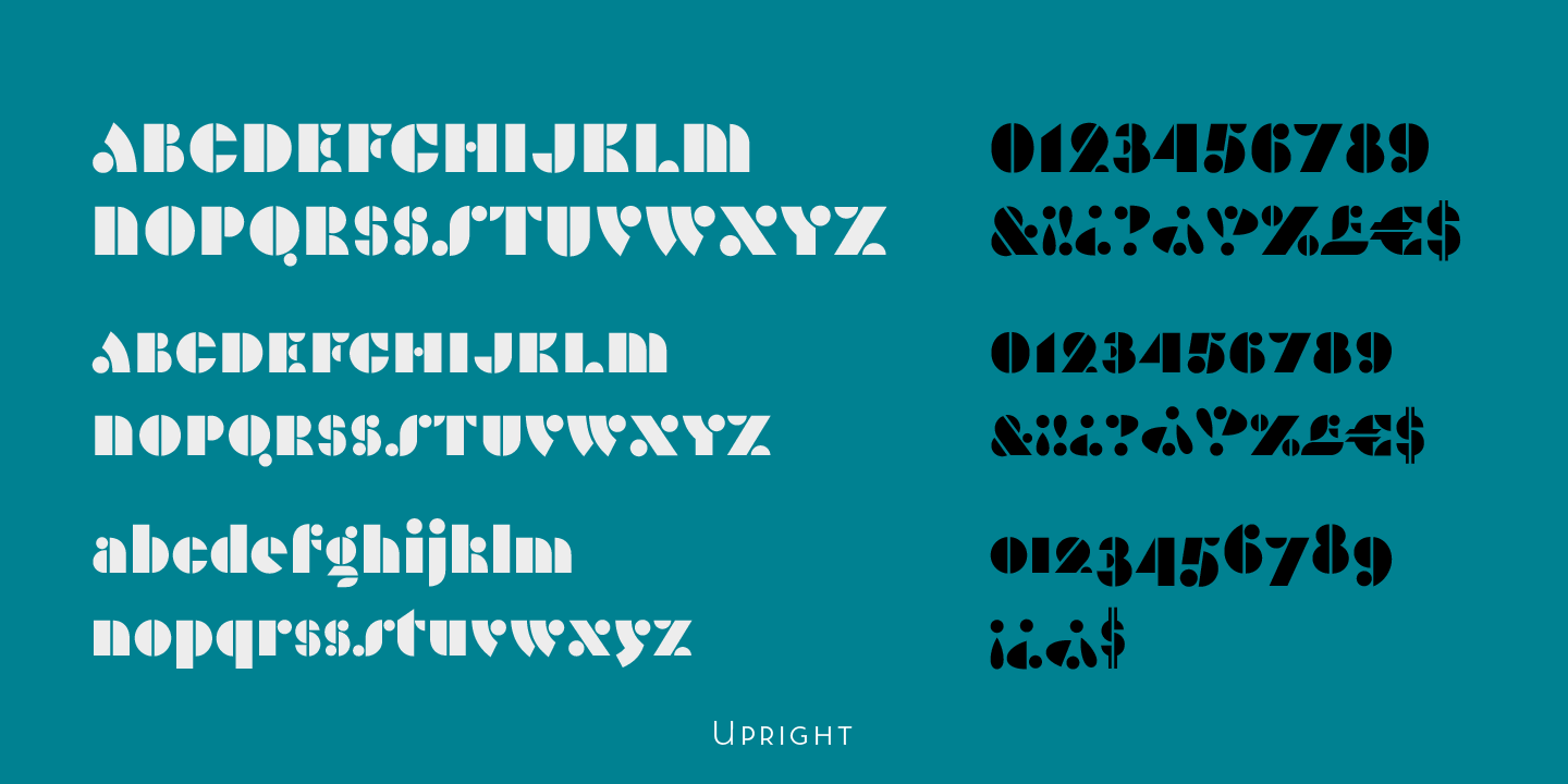
Record Store is a stencil font that makes strong use of round geometry. The impetus for this project came from a class branding project for a record store in which I needed something round and geometric to echo the feel of the logo. Flipping through Louise Fili and Steven Heller’s Stencil Type and I found a sample of an all caps lettering stencil lettering set from 1937 which I used to create the logotype. Following the project, I fleshed it out into a full font adding a lower case and a full set of diacritics.
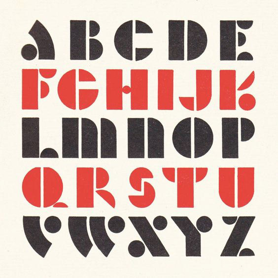
1937 Lettering Specimen
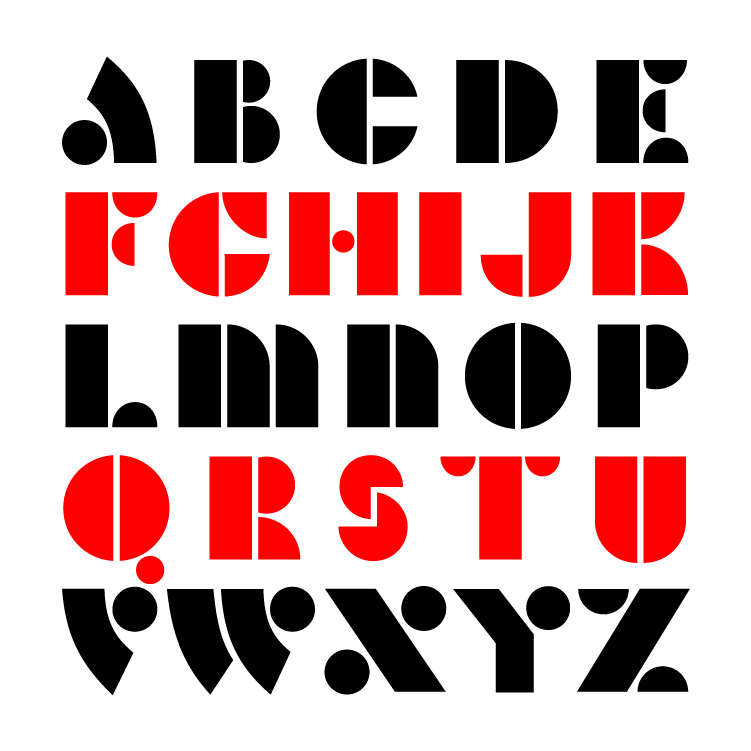
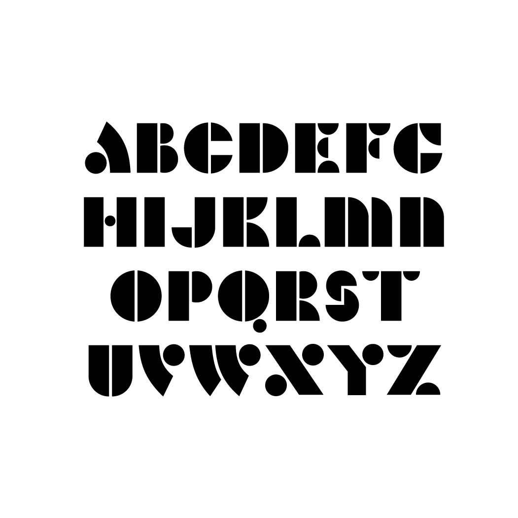
Record Store Caps
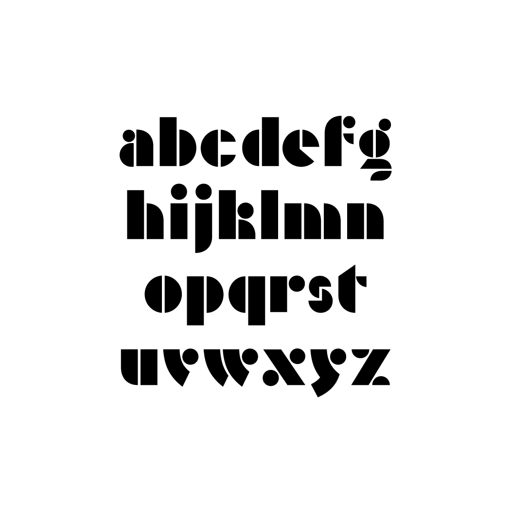
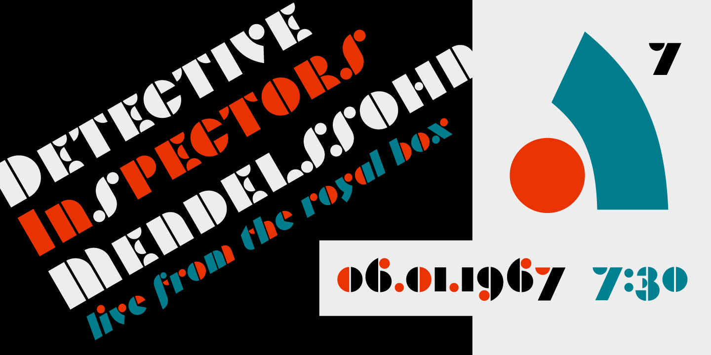
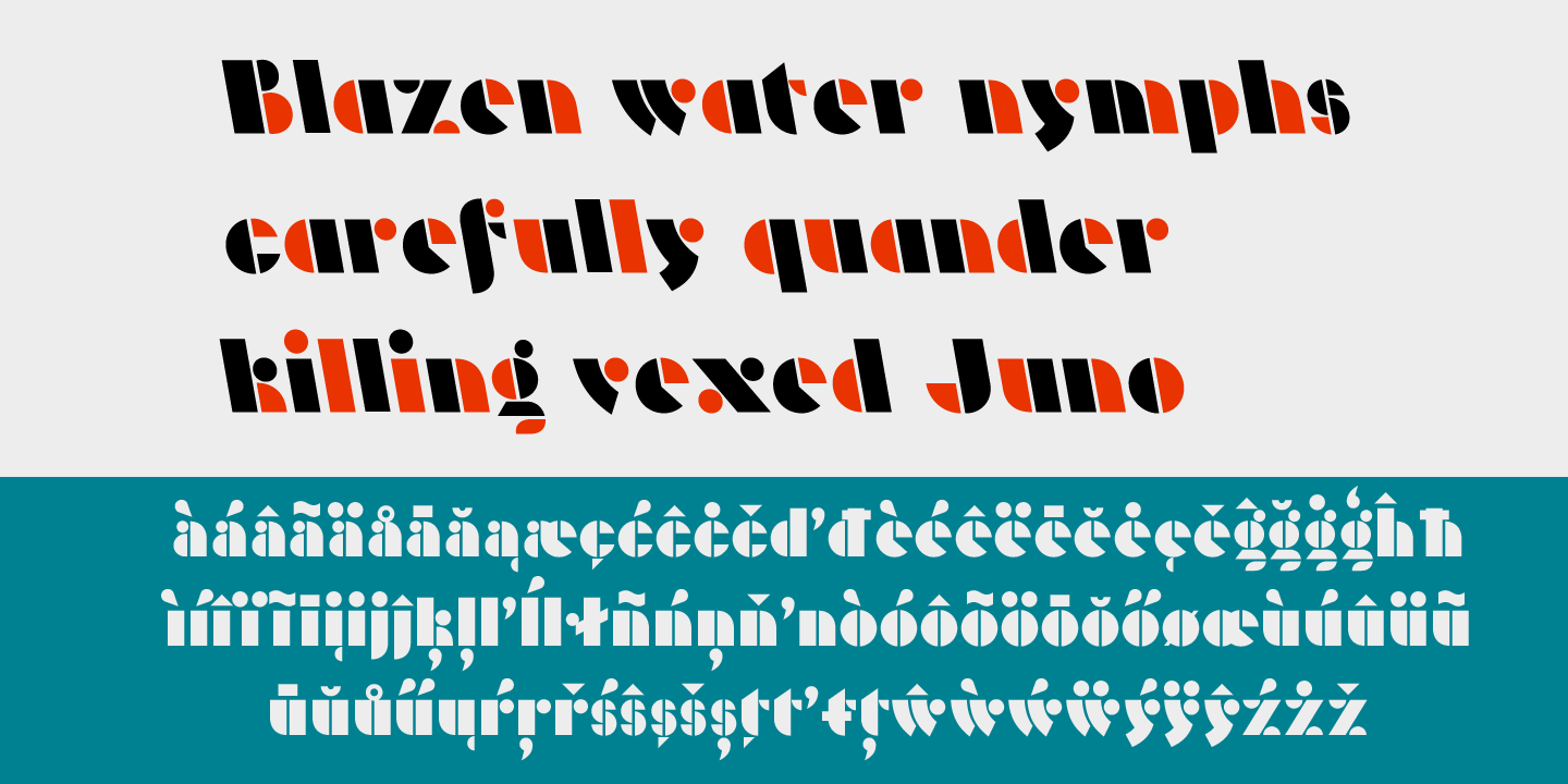
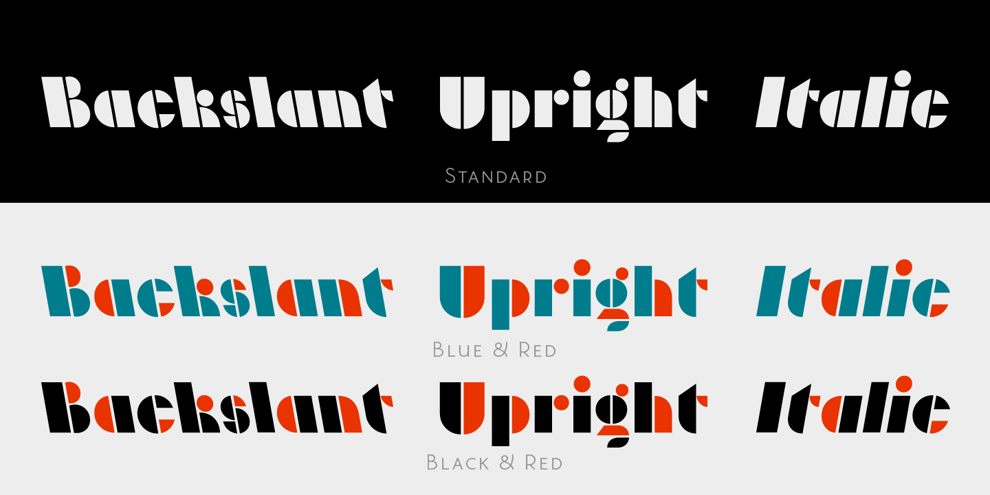
From the initial specimen, I changed and refined the forms to better suit readability and uniformity, most notably in the 'R' 'K' and 'G.' I now had a full set of capitals. I decided to see if the design could be extended to the lowercase. Drawing on the basic shapes used in the uppercase I was able to create a corresponding lowercase. In the end, the final result was heavily a geometric modular display face that lends itself well to chromatic application.